Table of contents
- How does a Digital Nudge work?
- In an information-saturated environment, we must constantly filter out more and more information. When making decisions, we find it difficult to limit ourselves to the essential information and thus make “smart” decisions. We literally can't see the forest for the trees. We constantly have to select the most important information and then we have to rely on heuristics.
- These are 10 Digital Nudges you should know
- Examples of frequently used nudges are Re-Framing, use of social norms, Ease and Convenience, Disclosure, Warnings and Graphics, Pre-Commitment, Reminder, Feedback, Expecting Errors, Simplification and the Direction-Nudge. These Digital Nudges are successfully used by many website operators in different industries and therefore you should definitely try to apply them on your site, as they will ensure that your users remember your website positively.
- Conversion Optimization Software
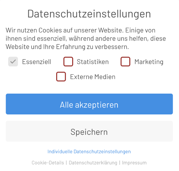
Have you clicked on a cookie banner on a website today? How did you decide? Why did you decide that way? Most people intuitively click on “Accept all” when a cookie banner appears, so that this annoying overlay quickly closes and they finally get to the content they actually came to the site for. This micro-decision is made by us in a fraction of a second and lies in the design of the banner – A Nudge!
The data protection consent is the most common digital nudge that we encounter daily. But how do we make these micro decisions and what mechanisms play a role in this? What other mechanisms (Digital Nudges) can we use? In this article, guest author Fabian Hans will highlight the background and application examples of the 10 most well-known Digital Nudges in e-commerce.
Recommended E-Commerce-Platforms & Shopsystems
On our comparison platform OMR Reviews you can find more recommended e-commerce platforms & store systems.
We present over 230 solutions that are specifically tailored to the needs of small and medium-sized companies, start-ups and large corporations. Our platform offers comprehensive support in all areas of online commerce, from product presentation to customer management. Take the opportunity to compare different e-commerce solutions, taking into account real user reviews, to find the perfect system for your individual business needs:
How does a Digital Nudge work?
We marketers still remember a time when the hurdle of the cookie banner did not yet exist. All users had already consented by default, or were unaware of the tracking. Following the General Data Protection Regulation (GDPR), however, the opposite now applies – "Privacy by Default", and few really have a Do not track add-on installed by default or do not consent. In most cases, the users are nudged back into tracking. The users do have the choice of whether and how they want to be tracked, but they intuitively click “Accept all”. An individual data protection setting would be much more difficult for users, as they would have to inform themselves and because this option is not directly noticeable, as the visual hierarchy is on the button for consent to tracking.
In the case of the cookie banner, users are not tracked by default. The default, i.e. the set preset, which can then be withdrawn (opt-out clause), is crucial for the behaviour (opt-in clause). In the case of data protection, users have had the opportunity since 25.05.2020 to consent to tracking (opt-out clause). The default setting was reversed on 25.05.2020 to give users the choice. This preset pre-selection is also discussed in politics, for example in the case of organ donation.
In some countries, all people are organ donors from birth and therefore the percentage of donors is significantly higher, as many people do not inform themselves about the topic. In Germany, people are not organ donors from birth and must first inform themselves about this option in order to become organ donors – and for this they have to make a certain effort to inform themselves.
The default per se is one of the best-known Digital Nudges to be discussed in this article. Many website operators use this pre-selection for conversion rate optimization. Through the Default-Nudges sizes, delivery options, or payment methods are pre-selected"," to allow the user to make quick decisions and not have to think during the ordering process. However, caution is advised, as a preset pre-selection can also have a negative effect on purchasing behavior. Tests show, for example, that a wrong pre-selection of payment methods can inhibit the conversion rate.Why do we make decisions intuitively?
From your everyday life, you know, for example, the labels for vegan products, the Nutri-Score or the TÜV seal in the elevator. These badges provide information that enables us as customers to make smarter decisions in a simple way. Without these badges you would have to study the ingredient list exactly and know exactly which ingredients have which meaning for your body, in order to make the right decision. But if you have a craving for sweets (Vegan, lactose and sugar free of course), then this “informed” type of decision making would be torment, especially when it comes to impulsive buying behavior, where we want to act quickly.
Basically, Nudges are about simplifying the decisions, and even more so the decision-making processes of your website visitors – so that the right information is available in a simple way. To optimize the conversion rate, it is important that users can make simple decisions and thus reduce the cognitive effort, i.e. the friction.
In the purchasing process, users make micro decisions, and these are made in a fraction of a second. If we were to always consider which option is the best and if we were to always consider all possible factors, we would be overwhelmed by our everyday life. Therefore, we make many decisions quickly-intuitively or from the gut – and we rely on the nudges that our environment gives us. Thus we rely on familiar behaviors in decision-making, so as not to be overwhelmed by the flood of information. But on which familiar behaviors can we base on in conversion rate optimization?
These are 10 Digital Nudges you should know
Examples of frequently used nudges are Re-Framing, use of social norms, Ease and Convenience, Disclosure, Warnings and Graphics, Pre-Commitment, Reminder, Feedback, Expecting Errors, Simplification and the Direction-Nudge. These Digital Nudges are successfully used by many website operators in different industries and therefore you should definitely try to apply them on your site, as they will ensure that your users remember your website positively.
1. Re-Framing
This Digital Nudge states that the order of information or elements, i.e. the context, influences behavior. For example, if fruit is placed in front of the dessert at the arrangement of a buffet, then guests eat more fruit. If smaller plates are offered at the buffet, then the plates are perceived as full faster and the guests eat less.
This nudge can also be applied to the
information hierarchy on websites. When filling in online questionnaires for online insurances, for example, the order of the questions can influence the answers to the following questions. If, for example, in a commercial insurance policy, users are first asked about the expected annual turnover and then about the deductible per claim, users will choose a higher deductible, as it is perceived as lower and therefore less painful in relation to the expected annual turnover (framed).2. Use of Social Norms
As Nudges,
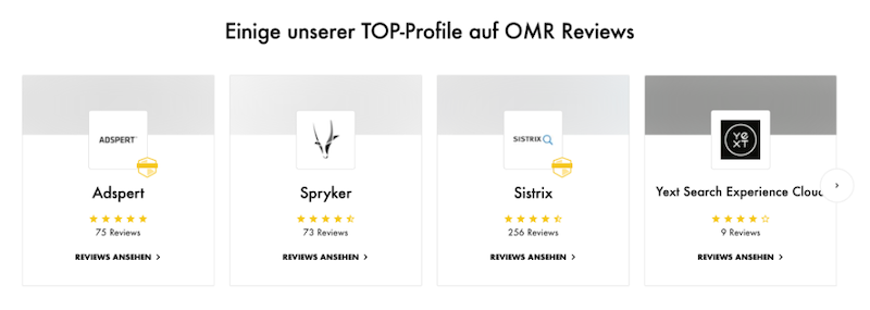
social norms can also be used. Our social norms contribute to us living harmoniously together, therefore we have an interest in making decisions that are accepted by many people. One can, for example, emphasize that a large proportion of fellow human beings already implement a certain behavior. This will then lead to it being implemented by the recipients of the message as well.In hotels, for example, hints like “9 out of 10 of our hotel guests reuse their towel” are used to encourage guests to reuse towels. On websites, for example, it is often shown with selection options which option most users have chosen. The Social Proof effect can be counted as a Nudge of this type, as it is in our common interest to
make decisions that the majority also makes and therefore to follow the behavior of the masses. This is also the reason why online rating systems play a big role in purchasing.Source: OMR Reviews
3. Ease and Convenience
A very reliable nudge is to rely on the user's need for
simplicity and convenience" (Ease and Convenience). Everyone has the need to move through everyday life without major resistance. You can rely on this exact behavior to influence the behavior of your users. The best-known example is when in the supermarket, certain products with high margins for the users are placed at eye level/grab height". People are more likely to buy these, as they don't want to bend over for other products. This behavior can also be used in the opposite way, if you want to prevent users, for example, from unsubscribing from a platform. Platforms like Facebook, for example, make it very difficult to unsubscribe from the platform.In e-commerce, this behavior is often reflected in the fact that users only click on the upper tiles of a category page. Consider carefully which products you first display on the category pages / on the homepage and whether you really want to display sponsored products here. Eye-tracking studies have shown that users only read the first lines of a text. This so-called F-pattern is also due to this behavior. Users have simply learned to move to their goal with minimal effort.
4. Simplification
Since we humans have this longing for simplicity, "
Simplification – Simplification" is a basic principle in the design of websites. Data protection texts, for example, must be written in simple language so that they are accessible to users. Especially explanatory products face the challenge of being explained in a simple way. If there is a high demand for information from users due to the products, then the information must be prepared in a concise and appropriate font color and size – ideally as bulletpoint lists. Expert terms must not be used and the content must not raise any questions. Only in this way can the users make an informed decision.5. Disclosure
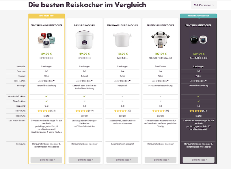
Similar to the principle of simplification is also the
declaration of all information (Disclosure) important in order for users to be able to make informed decisions. Here it is important that this information is presented in an understandable way. This type of Nudge comes into play in particular when deciding between several possibilities. The actual nudge lies in the presentation of the information in a comparable and clear way so that a good decision can be made. This nudge is also understood as disentanglement. A clear overview and structure on overview pages or comparison functions, which juxtapose product selection, help users better, and easier to make a good decision.Source:
A very effective Nudge is when users are expected to make a
Pre-Commitment (Self Binding Strategy)". This Nudge is based on the Commitment and Consistency effect. This describes the psychological tendency for people to always want to act consistently between actions and their intention. This is based on the fact that we as humans do not want to be perceived as constant.The conclusion of gym contracts works according to this system. Users can, for example, sign up for certain courses before signing the contract, do a workout and only then sign the contract. A non-binding commitment to the first training courses then leads to the contract being signed.
This Pre-Commitment strategy can also be used on websites, for example during sales promotions. Users can be asked on the page, for example, if they want to save x% on today's purchase. This early commitment will lead to increased sales later, compared to if they received a pure sales promotion.
7. Reminder
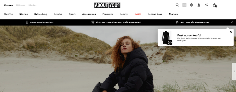
Our everyday life is full of information and tasks that need to be completed and processed. Often it is difficult to make a decision immediately, as one simply does not have the time to evaluate all the information at the moment. So the decision is postponed. A helpful Nudge then is
a short reminder (Reminder), which reminds that time is running out",". These reminders can be set by the user themselves – for example in a smart watch, which reminds us to keep an eye on the daily step goal. But also on the website or in an email, a Reminder can have a very strong effect on the conversion rate.Source: AboutYou
we receive feedback on our behavior
. This can be positive and negative. We love receiving positive feedback and we will automatically repeat our behavior so that the rewarding character of the positive feedback is repeated. Negative feedback, on the other hand, can hurt us in the truest sense of the word. To avoid this feeling of pain, we will not repeat the behavior.Feedback is therefore a very effective Nudge
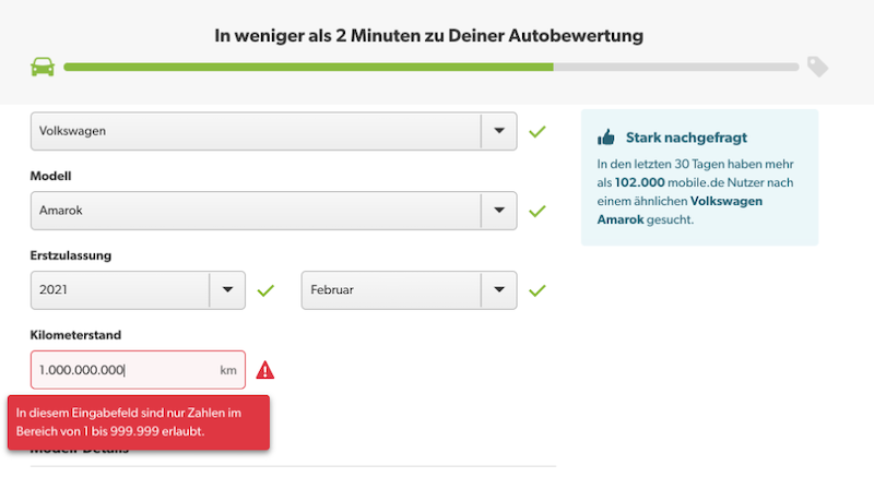
that can be used in various ways. If we want to reinforce the behavior, we give positive feedback and if we want to reduce a behavior, we give negative feedback. An example from everyday life are the smileys on speed limit signs – which show us whether we are behaving correctly or incorrectly. Warnings that are prepared as graphics or show us a desired behavior can be called Nudges.Source: mobile.de
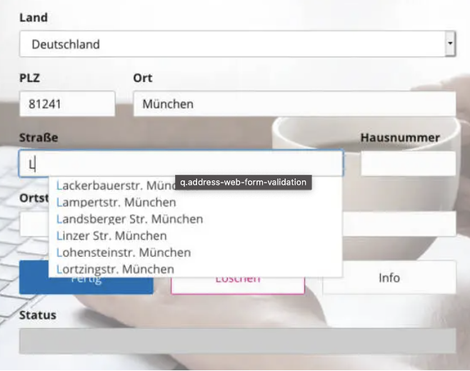
already anticipates possible errors
in advance (Expecting Errors – Expected Errors), which can occur with a certain behavior. This Nudge is supposed to prevent possible errors through adjustments in the process. An example of this is that the bank card must first be taken from the ATM before the machine issues the money. This prevents the bank card from being forgotten, as users conclude the “withdraw money” process with the withdrawal of the money. This Digital Nudge you can offer your users, for example, when filling out forms or using the site-search, by recognizing the entries and giving the users input suggestions, so that they make fewer errors.Source: https://www.qaddress.com/
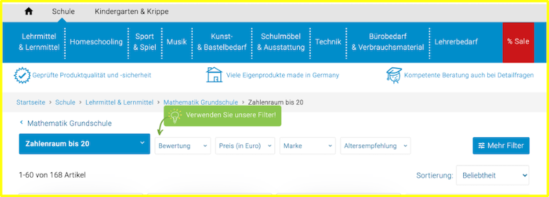
"Direction-Nudge"
. This Nudge became known by the fly in the urinal. Back then, pictures of flies were stuck in the urinal at Amsterdam airport Schiphol, so that fewer splashes go by. Through this simple measure “men scored” less splashes and the toilets stayed cleaner. You can give your users hints on your website to draw attention to a certain behavior. In this example, a hint was inserted for the filter so that the users can navigate better.Source: https://www.betzold.de/
Conversion Optimization Software