Table of contents
- Communication and Organisation: Well planned, sometimes spontaneous, always keeping everything in view
- Pointing the compass: Where should the journey go? What should the new OMR design deliver?
- Adventure meets order: high radiance and easy-to-use systematics for the appearance
- Order is half the battle in reading: More individuality, better readability, and less cost thanks to our own font
- Getting the design on track and setting the points for the continuous maintenance of the brand
- Design refresh wanted? These questions you should clarify
- These tools were used during the OMR design refresh with support from Arndt Benedikt
Lots going on in the cosmos of OMR: In recent years, the company has not only grown strongly, but has also been incredibly present in everyday life when it comes to the discourse and mediation of digital topics. It was precisely this growth that led to new challenges, especially in visual communication. But also with regard to the seemingly daily expansion of the portfolio with new brands and products. The existing corporate design reached its limits in terms of scope: for example, assets were missing to play all touchpoints consistently or a sufficiently defined brand architecture to represent the growing structure in an accessible way. The set of rules included the basic elements, but was restrictive and at the same time overwhelming and therefore not very relieving in everyday life. This is where the branding expertise of Arndt Benedikt's team came in to help the OMR team take the brand's visual appearance to the next level.
Arndt Benedikt is a branding and corporate design agency. From May 2022 to January 2023, they worked together with OMR on the brand's appearance. How the process went and which tools supported the design refresh, Falko Ohlmer, Managing Director at Arndt Benedikt, has written down for you here. Communication and Organisation: Well planned, sometimes spontaneous, always keeping everything in view
The project was carried out in close exchange between the colleagues of Arndt Benedikt and the project team of OMR, consisting of Head of Design Chris Albert, Managing Director Isabelle Gardt and Kim Wörner, Team Lead Creative Content & Social Media, and Markus Tiedemann, Team Lead Brand Experience. Regular appointments for personal meetings and workshops were arranged - live and in colour is always the most effective. Written communication was done via email and in a project-specific
Slack channel. Especially the short-term exchange intensified the cooperation and arising questions could be clarified directly. The common definition of suitable solution approaches increased the fun factor to 100 percent.
To keep an overview in the complexity, we at Arndt Benedikt use the project management tool
Trello for the organisation, planning and management of tasks and feedback. With clear
Kanban boards, progress and deadlines can be structured and the project can be worked on clearly.
Pointing the compass: Where should the journey go? What should the new OMR design deliver?
We were expecting an exciting project: The great challenge of catapulting an established brand to the next level. With this complex task, the first step was to develop a good route plan and define where the journey should go. To formulate the objective, the status quo of the visual appearance was analysed in advance: first get an overview, then collect everything and then start to tidy up and sort out. On this basis we defined the tasks of the new design, which clearly aimed at further development - however, without losing sight of the existing DNA of the brand:
✅ Create order: Enable orientation and assignment within the OMR cosmos and clear design hierarchies.
✅ Sharpening brand perception: Increase radiance and set new design impulses; at the same time, play all touchpoints uniformly.
✅ Making daily work easier: An easy-to-use set of rules for efficient implementation that offers quick solutions and surprises at the same time. In addition, optimise internal communication for feedback and further development.
Most important tool: a sharp eye, plus turn on your mind and think along. In addition to the tools already mentioned, Miro came into play: This is where the collection, analysis and consolidation were handled. Due to its intuitive operation, the online whiteboard tool Miro is perfect for creating moodboards and having them edited collaboratively by the team, even in real time. In the spirit of a common brainstorming session, elements can be easily added, noted and drawing areas and objects can be linked together à la mindmap.
With Miro, we also took the next step and created further moodboards and showed different design scenarios, illustrating how we can optimise the appearance. For this purpose, OMR Creative Director Chris Albert and his team also provided us with their research, which they had put together and commented on in advance with
Oroson. The feedback tool improves team exchange by allowing you to upload and comment on documents, such as images or artworks. The result: creativity, productivity and communication can be increased and optimised collaboratively.
Due to the different tools that were used, at this stage there was already a desire for a uniform tool that uniformly offers both exchange, rulebook and a hub for downloads. Story to be continued. 😉

New design, new elements: The design toolbox holds all important brand components of OMR ready
Adventure meets order: high radiance and easy-to-use systematics for the appearance
The homework was done, the guardrails were set and now we could finally start with the fun: the development of the design components and the visual systematics. We started a visual exploration, not a concrete development of a visual systematics with firmly defined assets. First of all, it was about letting the imagination run wild and developing artworks, i.e. looking for possible design approaches, from which order principles can then be derived in the next step. Early on, the idea was taken up that the digital cosmos should function as a visual guiding theme.
All the ideas developed in the exploration process were discussed in a workshop with the OMR team and assembled into a functioning visual systematics. The renewal of the appearance was broken down to the following points:
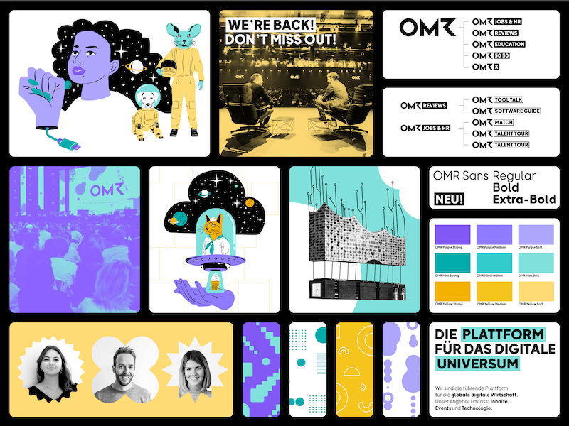
✅ Brand architecture: All sub-brands and products of the steadily growing OMR world were structured and sorted in a new brand architecture. This offers the target group recognition and orientation, and helps the internal team stay organised and keep an overview.
✅ Colours: The colour palette was retained, but the colour values were adjusted. Somewhat warmer and more vibrant, so that the colours appear more approachable and human. In addition, more flexible combination options were created and high contrasts achieved a barrier-free use on the internet.
✅ Pattern: A collection of multifaceted forms can be used individually or combined into patterns. In addition, various patterns were created that are ready for direct use. Each of these patterns can be used flexibly with surfaces or lines as well as in different colour combinations and zoom settings. These different patterns are used for backgrounds and are another building block for the unmistakable visual language.
✅ Image world: The classic black and white photo collages will of course continue to be used; after all, they are an important part of the visual guiding image of OMR. The same applies to real photographic images, as they also show a lot of emotion from the festival, everyday life or also protagonists. Clear but easy to implement rules have been created for the use of the photographs and the editing to limit the variety of options.
✅ Illustration: The existing image world was supplemented by an additional illustration concept. The elements of the illustrations are modular, so that objects and figures can be combined to form infinitely many new combinations. Creativity knows no bounds - the main thing is to continue to be weird and entertaining. The illustrations are definitely an eye-catcher and provide a surprising moment.
Although sketches were also made with pencil and paper, most of the work was done digitally. In almost the entire design process, the
Adobe Creative Cloud was our best friend. Especially
Adobe Photoshop and
Adobe Illustrator – also gladly in combination with each other. Since this involves work with strong visual expression and variety, both programs offer many advantages.
With Adobe Illustrator, as the name of the software promises, illustrations can be excellently created. These are vector-based and, unlike pixel-based elements, can be scaled infinitely in size – and without loss of quality. This makes the program perfect for our illustrations and also graphical building blocks and patterns, since all modular elements can be taken apart and put together again.
Adobe Photoshop – long a classic that you don't have to explain to non-designers anymore, offered itself naturally. The interface is easy to see at a glance and easy to understand. With classic workflows for image editing such as retouching and colour correction as well as for the construction of photo montages, a variety of tools and filters are offered. Layers, masks and effects can be easily adjusted and thus creative and complex compositions are possible. So it is exactly the right tool for all photo-based assets of our appearance.

Of course, the font belongs to the appearance of a brand
Order is half the battle in reading: More individuality, better readability, and less cost thanks to our own font
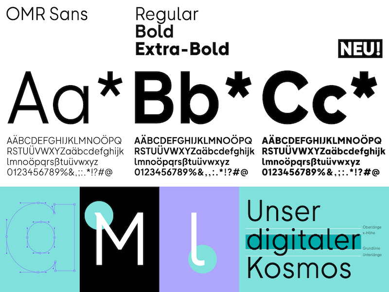
To increase the intended visual independence of OMR, we pitched the idea of our own font. This was commented by OMR Creative Director Chris Albert with the words: “That would be a boss move indeed, to enhance our radiance and at the same time more clearly determine the possible uses.“ This led to the development of the OMR Sans. The font with three cuts is suitable for both plakative use and bulk text. The organic and grown forms as well as the increased x-height result in a better readability in small font sizes. The font OMR Sans is therefore perfectly suited for digital use – not least also because the new font allows more text on less space. Especially on mobile devices and generally small screens, this is a huge win.
But order is also half the reading: Therefore, we have defined fixed hierarchies for the use in order to create more clarity on the information level in the design applications. So the font clearly increases the visual independence and differentiation strength of the OMR brand, but is also valuable from a business point of view, as it avoids the increasing licensing costs with the growing number of employees.
When creating the font, we started analog with pens and doodled on printouts of the previously used font Futura to see which peculiarities we would like to change. Further questions came up in the process: How can we make the font more organic and easier to read? How can we give the font its own character? For the development of the first characters and basic forms, the path functions of Adobe Illustrator were used to determine the shape language based on vectors. The font itself was created in the font program
Glyphs because it has more precise vector functions and can produce curves that are both more exact and take in fewer anchor points. With the help of Glyphs, we also compiled the characters into functional sets of characters and created font files for both desktop and web application from them.
To test the possibilities of use such as line spacing, letter spacing, and font sizes of the font, we used other programs of the Adobe Creative Cloud:
Adobe InDesign to check for print applications, and
Adobe XD for the use of the font in the digital area. Adobe InDesign is a professional layout and typesetting program for the use of texts, graphics, tables, diagrams, and images. Above all, the volume typesetting can be edited and optimised here using many functions. Adobe XD is the UX and UI design component of the Adobe Creative Cloud. With Adobe XD, graphic user interfaces for web and mobile applications can be created and converted into prototypes by linking the drawing surfaces.
Getting the design on track and setting the points for the continuous maintenance of the brand
But it's not only important to create an expressive visuality and enable all touchpoints to be played consistently through a simple system. On the other hand, it must also
ensure that a design is usable for all parties involved. From the beginning, it was our goal that the visual revitalisation of the OMR brand should also bring about a relief of work. This is where the brand management platform
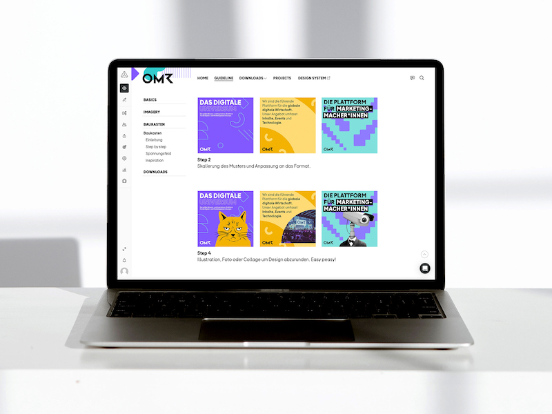
Frontify came into play: an absolute added value for the maintenance of the brand. Frontify is a comprehensive brand management platform that includes consistent brand guidelines, centralises the brand assets shown therein for download and, as a feedback tool, promotes efficient collaboration and quality assurance. Gone are the days of PDF guidelines that are stored in different versions on different computers and thus fuel sources of errors.

A brand also wants to be managed. At OMR, this has been happening since the design refresh using the brand management platform Frontify
Chris had been looking for a new feedback tool for OMR for some time and came across Frontify. With this idea in mind, the connection of a feedback tool and guidelines on one platform, he approached us. We wanted to be open to new things and expand our experiences – and started to research whether there are interesting alternatives besides the market leader Frontify. We cross-checked the results with entries at OMR Reviews. The good reviews and our own level of knowledge confirmed the decision for Frontify. In addition to the intuitive user interface for end users and editors, the easy user and access management and the individual configuration of the surface, there were other plus points such as the simple implementation and the associated fast setup – and all this happens in the cloud. Special mention should also be made of the good customer service and support, which feels faster than you can ask the question.
At Arndt Benedikt we set up the basic structure for Frontify, incorporated the guidelines we developed for the brand, prepared the DAM area (
Digital Asset Management) and also initially deposited the first assets ready for download – with clear names that help to be found quickly via the search. On this basis, the OMR team was able to be briefed easily on the rules of the revised appearance and the tool was used for the further purposes of Chris and his team.
The first applications were adapted to the new design for the
OMR Festival 2023. Here we helped with initial design suggestions, such as the first drafts for the stage design. Using the feedback function in Frontify, messages could also be sent quickly about the first drafts created at OMR and checked whether they were on-brand. Since the revised appearance did not start with a big bang across the board, it was possible to play, test and, if necessary, readjust certain touchpoints gradually.
Design refresh wanted? These questions you should clarify
If you want to revise your design, you should prepare for the refresh in advance. The choice of tools is derived from the goals and tasks that you determine in advance. To be able to name these, it helps to clarify the following points for yourself based on your existing branding:
✅ Does the design contribute to the positioning of the brand? Does it reflect what the brand stands for and make this standpoint visible?
✅ Is the design aimed at playing the required touchpoints and thus strengthening contact with the target group?
✅ Is a maintenance of the brand regulated to ensure that the appearance remains consistent in the future?
This way you can see where you need to start. Then get an overview of your tools and clarify which additional software you need in the future and which your company may no longer need.


