Table of contents
- Why is Mobile Content Creation a significant topic?
- What thumb type are you?
- What should be considered for Mobile Content?
- What mobile content is currently in popular formats?
- How do you develop mobile-friendly content?
- What are common mistakes in Mobile Content Creation?
- Which software & apps are recommended for Mobile Content Creation?
- Conclusion
Mobile Content Creation has become a central component of
digital marketing strategies. Given the increasing use of smartphones and other mobile devices, it is crucial to produce high-quality content that can be optimally displayed on these platforms. In this comprehensive article, we will discuss the importance of Mobile Content Creation, highlight key aspects, discuss popular formats, and provide practical tips for producing mobile content.
Why is Mobile Content Creation a significant topic?
The steady increase in mobile usage has revolutionized content consumption behavior. According to a study, in 2022, 58% of internet users worldwide completely surfed mobile, and German users spent 149 minutes per day on mobile internet (
Study 1 |
Study 2). Nowadays, most people access the internet through their smartphones, whether for browsing, consuming content, or shopping. Therefore, it is essential for brands and businesses to create content specifically optimized for mobile devices to effectively reach and engage their target audience.
As many users no longer focus on quantity but quality when web surfing, this plays a significant role in the online marketing area. Large search engines like Google have long since responded to this trend. Thus, mobile-optimized content is displayed higher up in the search results. So it not only helps the consumer but also helps marketers to dress up their content and offers to suit mobile screens. Also, neglecting Search Engine Optimization (SEO) for mobile content can lead to lower visibility in search results.
What thumb type are you?

The big question right off the bat:
How do you most often hold your smartphone? Everyone seems to have personal preferences here. The findings of the
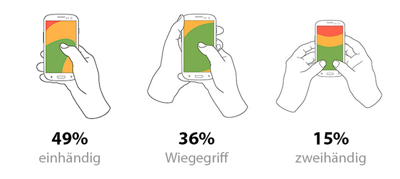
User Experience professional Steven Hoober, published in February 2013, remain timeless. In a study, over 1300 mobile users were observed and analyzed in various situations. Together with colleagues, Hoober publicly examined the use of touchscreen mobiles in train stations, pedestrian zones, and cafes, noting and documenting it. In doing so,
three primary hand-held postures were identified: 49% of users operated their devices with one hand, 36% supported one-handed operation with the second (usually left) hand's flat palm, and 15% preferred to use both thumbs. However, it is also important to emphasize that people change the position depending on the situation.
What should be considered for Mobile Content?
There are several important factors to consider when creating mobile content to ensure optimal user experience. These include the
loading time of the page, adaptation to different screen sizes and resolutions, user-friendly navigation, and the use of appealing visual elements. Moreover, it is crucial to produce content that is easily consumable and meet the needs of mobile users.
We have compiled the most important do's and dont's for you:
Dont`s
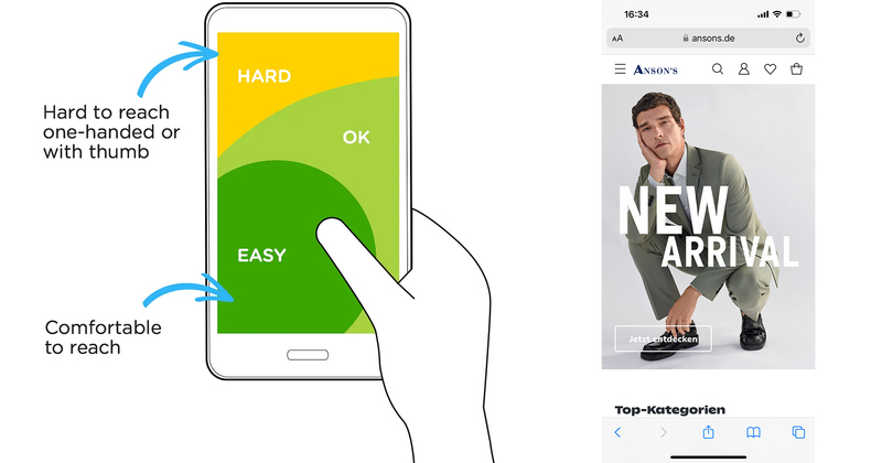
- You use upper corners for essential actions. It can quickly become uncomfortable for the user if, for example, the "shopping cart" button has been placed at the top of the screen. The larger the device, the more significant the problem. For one-handed users, the buttons are in a hardly reachable zone without twisting their thumbs.
- You only test your Responsive Design on one device. Consider the diversity of smartphones, and especially screen sizes, and display forms per operating system and browser. Sometimes, adjustments are necessary to ensure smooth one-handed operation across all devices.
- You set up an elaborate header on the homepage to create an effect for newly arriving users: e.g., in the form of motion pictures, flying in typography, scrolling experiences, or animations. This "eye-catcher" only works to a limited extent on a smartphone and certainly not 1 to 1. Here, a scaled-down version is required, or you can confection a mobile-friendly experience for your homepage.
- Your mobile website is too text-heavy. Usually, smartphone users read less than desktop users. Tools like Neuroflash help to create brief and concise texts for mobile use.
- You do not produce video content as it will ultimately be viewed by the user. In mobile content creation, the topic Video should also not be neglected, which should also be easily playable and resolved correctly on smartphone displays.
- A common mistake in creating mobile content is not adequately considering the needs of the users. Long loading times, poorly readable texts, and unclear layouts can cause users to leave the page prematurely.
Do`s
- Prioritize Key Actions: Identify the most important functions in your mobile website or app and place them within the natural reach of the thumb. Actions such as "Back", "Home", "Cart", "Search" and "Menu" are usually frequently used and should be easily accessible.
- Use Reachable Positions: Make interactive elements like buttons, tabs, and navigation menus in the lower part of the screen ensure they are easily accessible with the natural movement of the thumb.
- Implement Thumb-Friendly Gestures: Integrate intuitive swipe gestures that allow users to carry out frequent actions such as swipe left to go back or swipe right to show additional options. This reduces the need to reach certain buttons.
- Responsive Design: Implement responsive design principles to adapt your user interface to different screen sizes and optimize the layout for one-handed operation on both smaller and larger devices.
- Conduct User Tests: Collect feedback from real users through user tests to identify pain points and improvements in your thumb-friendly design approach.
What mobile content is currently in popular formats?
Mobile users consume a variety of content, including texts, images, videos, podcasts, and interactive content. However, video content is especially popular, or anything that is visually quickly arousing because such content is easily consumable and has a high engagement rate. Short, concise videos are particularly suitable for mobile viewing and can be effectively used on platforms like Instagram, TikTok, and YouTube.
Looking at the
E-Commerce sector, it is mainly the elements that ensure fast accessibility of information. Here, depending on the offer, individual solutions have to be found to specifically pick up the user. An A/B test should by now be applied as standard in the mobile sector - and regularly. Since many users shop mobile, responsively designed websites are crucial for a smooth shopping experience.
Personalized push notifications help give the user their happiness. Through targeted notifications, offers, discounts, or news can be transferred directly to the customers' mobile devices. The integration of
chatbots in messaging apps improves customer service and simplifies the buying process.

Providing a high degree of operating comfort on websites is critical to provide a positive user experience and increase visitor satisfaction. By placing important elements in the
"easy-to-reach" area, navigation is simplified for users, regardless of whether they hold their devices one-handed, two-handed, or in a cradle grip. This improves accessibility and interaction, reduces frustrations, and increases the likelihood that visitors will stay on the website, consume content and ultimately perform desired actions, whether buying a product, filling out a form, or reading information. Good operating comfort thus directly contributes to the
conversion rate and long-term customer loyalty.
How do you develop mobile-friendly content?
The trend is increasingly towards
"Bottom-Navigation-Pattern" on mobile websites, but it has not yet arrived in Germany. In the DACH region, the trend towards "Bottom-Navigation-Pattern" on mobile websites has not spread as widely as in other regions, possibly due to cultural differences, more conservative approaches in
web design, different user preferences, and potential technological challenges. However, I think the main reason is the fact that existing navigation patterns on websites are known and continue to be used. Humans are creatures of habit. The slow adaptation to this trend could be a combination of these factors, which may be further developed over time as preferences change in web design and user experience anyway.

The development of mobile-friendly content requires careful planning and execution. It is important to use responsive designs that automatically adapt to the screen size of the end device. Moreover, content should be optimized for smooth navigation and rely on visual elements such as images and videos to pique the interest of users. Regular review should also be done to ensure the user experience still fits the offer.
What are common mistakes in Mobile Content Creation?
In the mobile content area, small mistakes quickly become serious operational hurdles. The desktop area forgives more due to mouse or trackpad operation, as well as the size and division of content.
Checklist of errors to avoid:
- Long blocks of text
- Unreadable font size
- Overloaded Pages
- Non-mobile-optimized images
- Ignoring loading times
- Missing Call-to-Actions
- Complex Navigation
- Neglect of user-friendliness
- Non-responsive design
- Insufficient test runs on different devices
Which software & apps are recommended for Mobile Content Creation?
To effectively create mobile content via smartphone, a limited number of software and apps are available. Recommended tools include, for example,
Neuroflash, which provides an intuitive user interface and powerful features to create and optimize content for mobile devices. Other useful tools can be found in the
Content Marketing Category from
OMR Reviews. In addition, the app from
Canva can be considered. Here, you get a slightly stripped-down range of functions compared to the desktop version.
Also, programs from the
Adobe Creative Suite are available on mobile devices. However, these only help for quick use or serve as a bridge. I do not recognize any real added value from the use of the tools for long-term application:
I recommend creating all in-depth designs for websites, campaigns, advertising materials, or digital content on a desktop PC because everything is detailed more accurately for campaigns etc. in many cases,
Adobe InDesign the right tool of choice would be the one that only exists as a desktop app.
Conclusion
Mobile Content Creation has become a critical factor for the success of digital marketing campaigns. By creating content specifically optimized for mobile devices, brands and businesses can extend their reach, boost their engagement, and build long-term customer relationships. By taking into account important aspects such as load time, adaptability, and visual appeal, they can ensure that their content is optimally displayed on all devices and has a positive influence on the user experience. Mobile content is best created on a desktop PC, using smartphone apps only as little helpers.


