Table of contents
- What does content design mean?
- Content Designers - Part of the Team or a Team
- Why is Content Design important in Marketing and for Organizations?
- How to successfully implement Content Design
- Which tools are particularly helpful in implementing content design?
- Conclusion on Content Design
Our guest author Robert Weller explains in this article what the significance of content design is and gives practical tips on what to look out for when creating content design.
The supply of content already exceeds demand today and the increasing use of AI-supported content creation tools is causing the output to shoot up almost infinitely in the near future. #Isso
For companies, this outlook initially seems quite good, after all, more content also means more opportunities to come into contact with their own target audience.
But the question remains, how can companies still gain the attention of their target audience and overcome their "content fatigue"? After all, we as users don't always want to consume more content, but rather less and more relevant. Whether for information or entertainment.
One solution lies in targeted "content design", where from a conceptual point of view, these two intentions are combined: The interests of the consumers are in the spotlight when creating content, with which companies pursue their economic goals in the sense of lead generation or direct sales.
What does content design mean?
In German, "design" is often equated with visual design, but this falls short in the context of content design. Ben Harmanus and I based the following definition on our book:
Content design describes the targeted conceptual and audiovisual design of digital content to optimize the customer experience as a strategic competitive advantage.
At its core, content design revolves around how content can function best. This includes, in addition to the actual content (information, education, entertainment, etc.), senders and receivers - i.e. content publishers and consumers - with their respective goals, requirements, needs and preferences as a dimension, as well as the different channels and platforms on which the content can be experienced.
Content design is therefore above all a mindset, an approach to the use of (digital) content and less a discipline or concrete tactic. Content designers deal with the influence of the design on the
Functionality(usability),
effect (perception, emotion) and above all
effectiveness of content in terms of their value contribution. Or to use the
mission statement from Meta to use:
Content designers bring clarity, consistency and compassion to Meta's products. We provide the context and guidance that help people understand the value of our products and how to use them.
Content Designers - Part of the Team or a Team
The profession as a content designer is not yet widely spread in this country, but it is already established in Great Britain and the USA. However, the demand and thus also the number of job vacancies is increasing, as a look at LinkedIn Jobs shows:
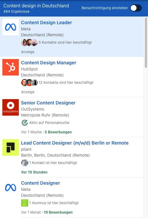
Content designers are in demand and are increasingly sought after in addition to related fields such as content strategy, content management and UX Copywriting (Source: LinkedIn Jobs)
Companies like
HubSpot Marketing Hub, Meta,
Shopify or Spotify now have dedicated personnel or even entire Content Design Teams – albeit with different focal points within the company.
The marketing context is probably most interesting to you, so let's take a look at what content design can do here.
Why is Content Design important in Marketing and for Organizations?
On the one hand, organizations benefit from the radical user-centeredness that makes content design possible in the first place. Because in order to know how you can best satisfy the needs of your users with your content, you first need to know your users and their needs. Unfortunately, there is often a problem in marketing. An additional impulse from content designers as "advocates of the customers" is certainly valuable. Strictly speaking, the consumers of your content actually benefit from this…
On the other hand, the "finesse" for effective design can measurably increase the performance of all content - be it in the blog, in social media, in ads or in print - for example with a view to click rates, conversion rates or qualitative measurement methods. This is also one of the principles of content design: based on hypotheses, the effect of the design (again: please do not understand only visually) is always measured, in order to be able to derive own (!) standards and quality criteria from this. "Good" content cannot be described generically or derived from a competitor analysis, as is the case with branding. Brands like mydays would never have developed their "together time" as a brand core without the focus on their customers or Levi's would have found their slogan "Live in Levi's".
This brings us to basic design principles with which content designers work.
How to successfully implement Content Design
You can find content practically everywhere, but it doesn't serve the same purpose everywhere (from the publisher's point of view). Sometimes it is used to gain attention, sometimes to inspire potential customers in the moment and sometimes for direct conversion. Red Bull Stratos is one of my favorite examples because at first it looks like advertising to get the brand talking. I don't want to contradict that, but around the actual jump, incredibly exciting content was created - including almost scientific articles about the stratosphere. I guess only the less people saw this in all the excitement in space
… If you want to delve deeper into this, you can have a look at the example of
Red Bull Stratos.
Let's take a look at the first scenario, in which organizations want to gain and to some extent direct the attention of potential customers through content.
Deep Dive 1: Gaining Attention
Through conscious content design, you can specifically influence the perception of your content and direct the attention of your users. The following design principles have proven useful for this:
Contextual contrast:We pay attention to things that are different. If we drive on a busy street in the same direction as everyone else around us, we react quickly to a car turning right from a side street. Why? Because it is going in a different direction. Towards us. Because it is not following the flow (unless it is an electric car …). Because it may be driving faster or slower than we are.
The same principle of continuity and common fate (a law of gestalt theory) can also be experienced in social media feeds: If you scroll through Insta and only see blue pictures, a yellow one immediately stands out and motivates you to stop and look (a so-calledthumb stopper). It has won your attention - because it is different than what you normally see and consume.
Similar functionality also applies to search results in the form of SERP features like rich snippets, knowledge panels or site links. If you manage to make your preview look different from the rest of the search results, it will get more attention. Here is an example from the search for the best CRM software:
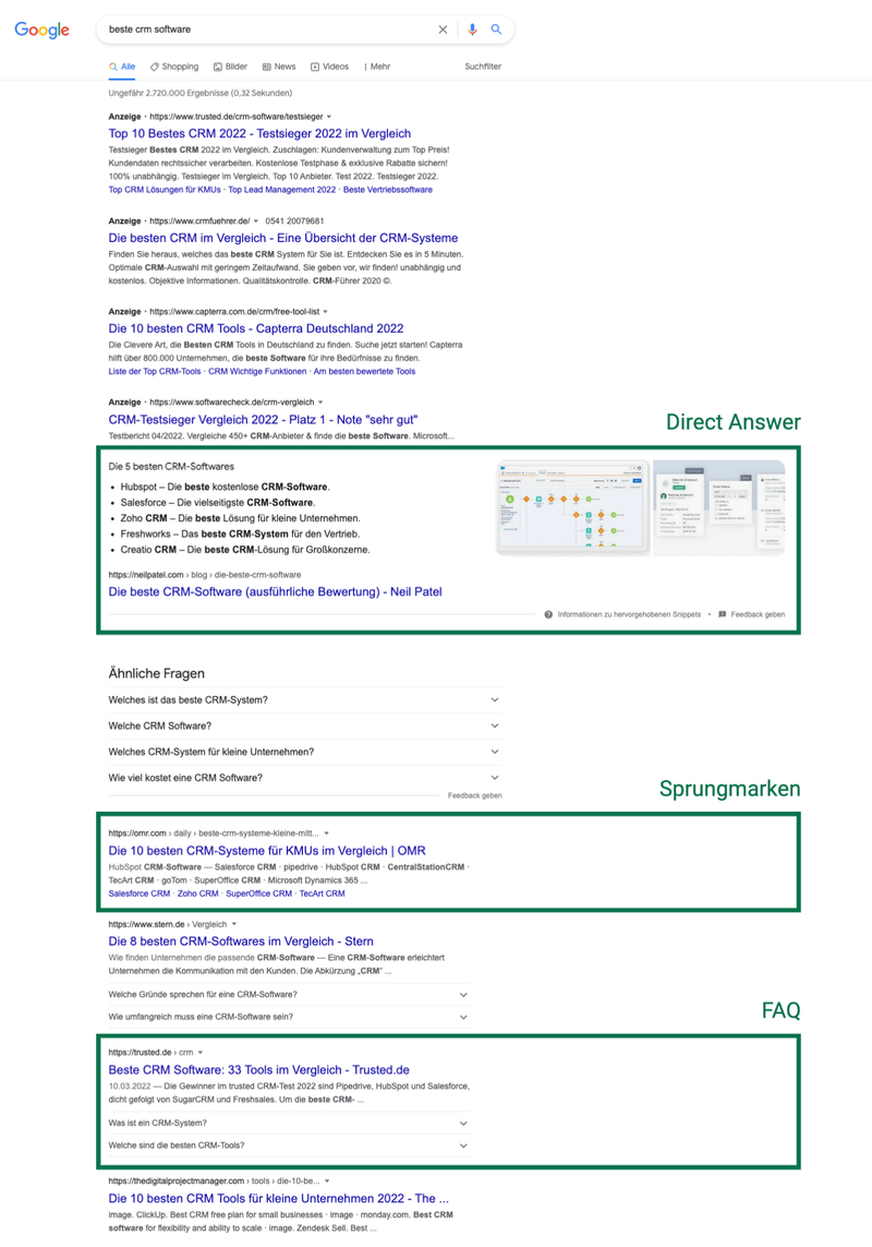
Neil Patel scores with direct answers and images, OMR with jump marks to software reviews and other pages with FAQs (source: Google search)
Maximum reduction: Another way to create attention is reduction. A small selection logically leads us to focus on what is there. Likewise the "silence" created by whitespace and gives the important elements the necessary space to work. Apple is a good example, as for a few days in January, only Fitness+ was advertised on the homepage (!). Of course, visually with the help of Apple devices that show the actual product (i.e. the app/software), apart from this visual, however, exclusively through a short text and two buttons - one of which was highlighted in color - on a white background. This is Content Design at its finest!
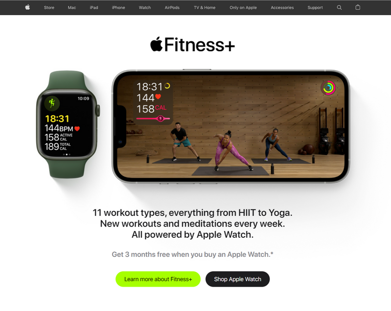
apple.com temporarily focused its new product Fitness+ on the homepage and removed all other elements except the footer (source: apple.com, January 2022)
There are many other principles and best practices to gain attention. Their execution would go beyond the scope here. I recommend you to deal with
gestalt laws and apply them to your social media creatives, landing pages & Co. Also
consistency is an important identification factor, especially in social feeds. Just look at the contributions of
Josh Rauer on LinkedIn (see screenshot below) and you will quickly understand that his visuals, due to the color, style and content elements, have a high recognition value and thus relatively easily get attention in the feed. After all, people follow other people to see their content.
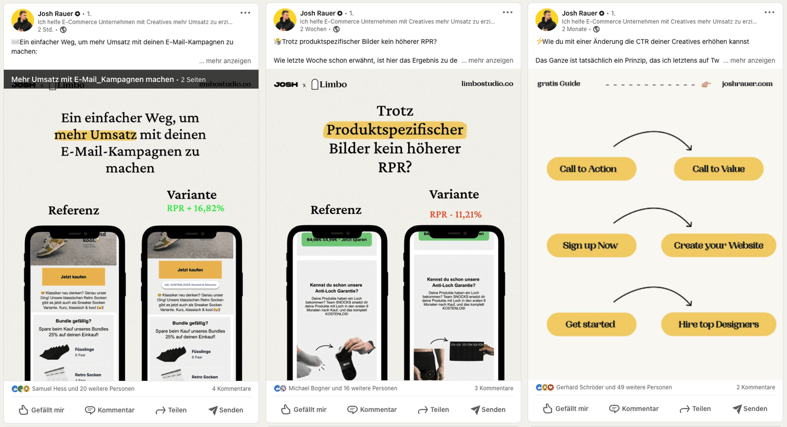
Visual consistency in an individual design style creates attention and recognition (source: Josh Rauer on LinkedIn)
In the end, you need to understand in which environment your content is seen (or should be) - also whether it is passive consumption (social media) or an active search (Google & Co.) - and adapt the focus of the design accordingly. And of course, keeping your own goal in mind, because only a few of us can live from attention and the associated reach alone. ;-)
Deep Dive 2: Increasing Engagement and Achieving Conversions
When it comes to motivating people to action, you find yourself very quickly in the realm of consumption and behavioral psychology. No wonder, then, that many of the "conversion-centered design" principles are based on so-called behavior patterns. Through targeted design, you can significantly influence the conversion.
Here are a few examples of how you can increase the likelihood of an action, such as the purchase completion on your website, through content design - textually, visually, structurally:
Anchoring:Especially software providers like to supplement their pricing plans with hints like "this price equals just one cup of coffee a day" and thus create a comparability to the real world, with which potential customers can immediately identify. However, what is even more important: 1.99 €/day sounds much less than 60 €/month and therefore increases the chance of a subscription. The same applies to the "price reduction" by communicating a smaller time frame, e.g. month instead of year or week instead of month. Just under 60 € for a meditation app is really expensive, but 4.83 € sounds fair. Especially compared to the usual 12.99 €! A real snatch.

Headspace designs the price communication diversely, so that for every decision type (e.g. cheap or flexible) there seems to be the right offer (screenshot: headspace.com) Implicit signals:Also in the context of price design - but not exclusively - you can use implicit visual signals to communicate "hidden" messages. Here is a simple example: Which price appears low/cheap, which high/expensive?

The implicit visual design of prices has a major influence on the perception of product quality and an offer (Image: konversionskraft.de) But beware: Cheap is not always better! Some products and especially brands sell better because they are expensive - and therefore appear qualitatively superior and exclusive to a certain group of people. Think of Apple: The hardware of an iPhone is not necessarily better than that in smartphones from other brands. But would Apple be so successful if they were to "flog off" their products with red slashed prices?
Social Proof:Assessment platforms have a major influence on purchase decisions. A look at common online shops shows how valuable the integration of social signals is - whether in the form of star ratings, customer reviews or expert opinions. When others confirm the quality of a product or service "with their name" and their face, then it will be good. Or?!
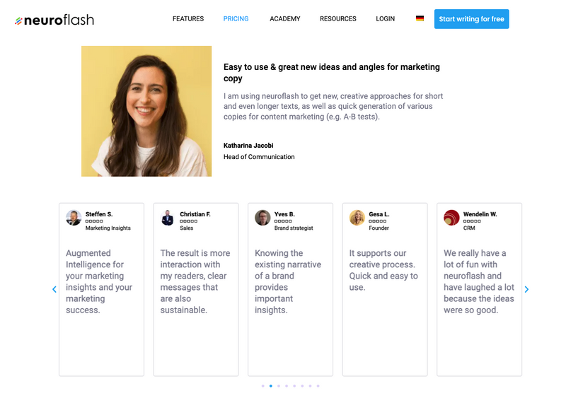
neuroflash advertises on their pricing page with customer logos, selected testimonials and (generated via review platforms like OMR) customer opinions (screenshot: neuroflash.com)
You surely know more of these principles, such as urgency and scarcity, ranking "The 10 best …" or Zero Risk Bias (free shipping). Individually, but above all in combination, they all serve to increase motivation for purchase completion (or click, newsletter subscription, e-book download, etc.) through linguistic, implicit or direct visual design. A good overview of these so-called behavior patterns with application examples can be found
in the blog of konversionsKRAFT.
Which tools are particularly helpful in implementing content design?
As OMR readers, you are certainly also interested in the tools of trade, which is why we have put together a small list of typical content design software for you. This is definitely not complete (and probably never will be), because the individual tech stack depends largely on the respective focus and can hardly be described in a list. See it as a suggestion for the diversity of this up-and-coming profession and inform yourself on OMR Reviews about the different possibilities of use.
- For Social Media Suites Creators, tools for designing stories, reels & co., as well as Photo Editing & Video Editing are essential. With Adobe Express you can implement a lot of this within one software/app – and as of recently, you can even post it directly on your profiles. Popular alternatives are Canva especially for pictures and flixier for videos. If you want to quickly create a mockup, you will find help at placeit.
The decisive factor in choosing a suitable tool will be whether you primarily work on the desktop and want to use professional software like Adobe Photoshop, Adobe Lightroom, Adobe Premiere Pro & Co., or whether you rather work on your smartphone, with apps; or if you absolutely want to use both at the same time. - For the ad managers among you, tools for designing & optimizing landing pages as well as for copywriting are probably also interesting. Unbounce and neuroflash get my vote here. You can use platforms like MOAT and lapa.ninja for inspiration.
Unbounce simplifies the design of landing pages with templates and an intuitive interface enormously and allows you to optimize the pages directly via A/B tests. Dedicated A/B testing tools are therefore not necessary.
With neuroflash you can generate texts for ad ads, Social Media Posts, YouTube descriptions or your landing page (headlines, button texts, etc.) using artificial intelligence. This is faster than writing it by hand. The tool even allows you to define the desired tonality for your texts. - And for all of you who are responsible for content "in a broader context", for example on the whole website (keyword: Content Management Systeme (CMS) & Conversion Optimierung) or in the sense of the brand, the tools Frontify (Brand Asset Management), Hotjar (Onpage Analytics & Research) and Sanity(Unified Content Platform) are of interest. If you design a lot, you should ensure visual consistency and templates with Adobe XD or Figma .
My personal tip especially for B2B Brands:
PathFactory. Having content on hand for every "phase" of the customer journey is good. Accompanying potential customers on their customer journey and effectively
actively ensuring that they know the direction and take the next step, is even better. PathFactory does exactly that, just check it out!
Conclusion on Content Design
The impact of especially visual design on user behavior is undisputed. Through implicit communication and the integration of psychological triggers, content designers are able to specifically influence the attention, motivation and ultimately the activity of users.
Content design aims to support consumers - for example in gathering information, choosing the right solution or at check-out. Be it the purchase of a product or the download of the latest whitepaper. This creates the win-win situation.
So familiarize yourselves with the design principles and use the tools that simplify content design for you. The more experience you gain and learn from direct feedback and the evaluation of data what works for your target audience, your products and services and your brand as a whole, the faster content design will be a real business asset for you.


