Table of contents
- What is website navigation and what purpose does it serve?
- What types of website navigation are there?
- What types of main menus are there?
- The navigation of your website has an influence on your Google ranking at several
- The usability is an important factor for the quality of your website. It describes how user-friendly your website is, i.e. how easily site visitors can navigate and find desired content. Usability and website navigation are therefore closely related. User Experience (UX)
- Step 1: Find the right keywords
- . You give your visitors
Many relevant SEO topics come together in website navigation
including:
Keyword research, internal linking & User Experience.
By having a manageable website navigation, users have a good overview and can find their way around your website more easily. Google also positively rates a clear navigation structure, as it improves user flow and makes the site easier to crawl. Another aim of navigation optimization is to include frequently searched keywords that are suitable for categorization in the menu structure, so that the page is better found on Google. Because without a landing page, your website will not be displayed in the search results. For a good navigation structure, therefore, two important points have to be kept in mind: On the one hand, it is the correct naming, i.e. the selection of the correct keywords, on the other hand, it is the correct arrangement of the categories in the navigation.
What is website navigation and what purpose does it serve?
Website navigation is the area of your website that allows users to
orient themselves on the page and find the
desired content. Page navigation can come in various forms, such as menu bars,
breadcrumb navigations and so on.
What types of website navigation are there?
There are different types of website navigations that are suitable for different purposes, websites, and end devices:
The main menu is often displayed in the form of a navigation bar that links to the individual landing pages of your website. This menu can be displayed either horizontally or vertically.
The utility navigation includes links to useful functions or tools. These include, for example, buttons to log in or register, to the shopping cart, and also social sharing functions. Utility elements are often displayed near the menu bar or in the upper right corner of a website.
Filter navigations enable the displayed content on a website to be narrowed down. This type of navigation can be shown in the form of dropdown menus, checkboxes, or sliders. Filters can be very useful if there is a lot of content/products on a website and users want to narrow it down further. In addition, you have the option to cover more keywords without overloading the main navigation. To get found for these terms on Google, you need to release the associated filter URLs for the index. Also pay attention to the link masking and to what happens to URLs that are not released.
Breadcrumbs show visitors where they are on the website and how they can return to previous pages.
A footer navigation is a menu at the bottom of a website. Often this navigation contains links to contact information, privacy policies, or the imprint.
What types of main menus are there?
The main navigation can be divided into horizontal, vertical, and interactive menu types, with horizontal and vertical displays being the most common. What the differences are and when you should use which type of navigation, you can find in the next sections.
Horizontal Navigation
As the name already suggests, the menu items here are arranged in a row next to each other. This type of menu navigation is particularly suitable for the desktop view, when it comes to making important content quickly and easily accessible. A horizontal navigation is usually placed at the top of a web page and is directly visible to your users. A horizontal navigation is not suitable for you if you need a lot of space on the first level because you want to display very many and/or long menu items. An example of a horizontal navigation can be found on the OMR website:

Example of a horizontal website navigation using the OMR website(Source: OMR) If you need more space, you can also divide the individual menu items into two rows:

Example of a horizontal website navigation with two rows (Source: OTTO) However, if there are too many links, it can be difficult for users to find their way around. So make sure that the display is clear. The best number of menu elements available and how to structure your navigation is covered further down in the article under “How to create your website navigation“.
Sublevels in menus are often displayed as follows:
Drop-Down Navigation: Subordinate menu items fold down from top to bottom on mouseover. Mobile links become visible as soon as your user clicks on a higher-level link.
Flyout Navigation: In this menu, subordinate elements open from left to right.
If you want to display multiple levels of the menu at once, you are talking about a mega menu. Here too, users first click on the top category of your horizontal navigation. After the click, the subcategories appear in the form of a drop-down or fly-out menu. The special feature here is that your website visitor can directly access hierarchically deeper categories.
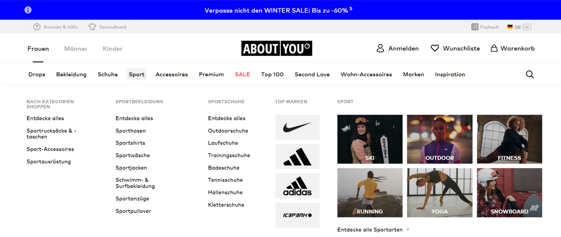
In the example from About You, site visitors can click on “Sportswear” or directly select a subordinate menu level such as “Sports Pants”.
With a mega menu, you have a lot of space for displaying your content. Pay attention to user friendliness and design it clearly, for example by ensuring a structured arrangement of the links.
Vertical Navigation
Vertical menu forms are alternatives to the previous standard of the horizontal menu. Due to the changed aspect ratios on smartphones, it is an advantage if the page navigation is also adapted to this.
The burger menu is the most widespread vertical menu and is ideal for mobile applications. It is displayed with three stacked lines, reminiscent of a hamburger - hence the name. In most cases, the menu is located in the left or right corner of the page. Stick to this, because this is what your users are used to.
A hamburger menu requires little space, as the actual navigation items are initially “invisible”. When the user clicks on the three lines, the hidden menu items are made visible and he can continue to navigate.
Example of an collapsed and expanded burger menu using the mobile view of the OMR website (Source: OMR) A vertical navigation is not just a mobile menu. You can also use burger menus on larger screens as an alternative to horizontal navigation. But be careful: If you choose this type of menu, the first-level links are also hidden on the desktop page and your user doesn't get a feel at first glance for what to expect. This also leads your users to have a longer route to their goal. Each additional click is another opportunity to bounce. In addition, this type of navigation is rather unfamiliar for the desktop user. For this reason, I wouldn't recommend it to you!
Interactive Navigation
Navigating here is part of the experience and the user reaches the next section or the next subpage through interactive elements. Usual navigation elements are omitted - so pay particular attention to the fact that the interactive navigation is intuitive and user-friendly and guides the user through your site. This type of navigation is less suitable for a classic online store, for example.
Desktop Navigation vs. Mobile Navigation: What needs to be considered with a Mobile Website Navigation?
Both the desktop and the mobile website navigation should be easy to use and intuitive. The two navigation types mainly differ in terms of usability by their representation. Many desktop menus are shown as a horizontal navigation. Since these are specifically for desktop applications, they are not recommended for the mobile menu. Smartphone users are used to vertical menus in the form of burger menus. So as not to confuse things, you should also use these.
You don't have to choose a type of navigation when designing your mobile and desktop websites, on the contrary! This way, for example, you can use a horizontal dropdown navigation for your desktop website and a vertical burger menu for your mobile variant. This is also done by large online shops like Zalando or OTTO:
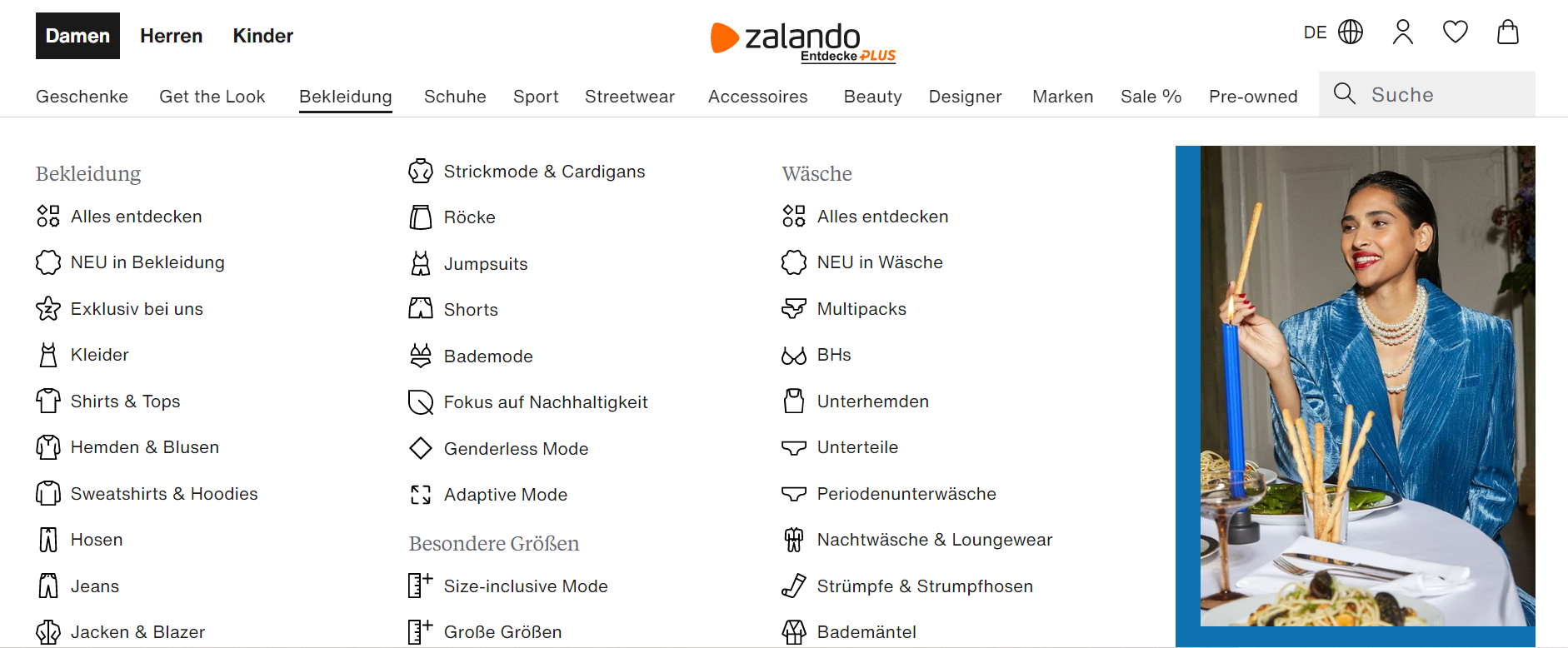
Example of a horizontal dropdown navigation of a desktop website (Source: Zalando) 
Example of a vertical burger menu for the Mobile view (Source: Zalando) When displaying your Mobile Website Navigation, you should consider the Responsive Design. Make sure that the menu items and links are easy to reach and that they can be targeted without the user having to enlarge the screen. That also means that the individual clickable elements (menu items) shouldn't be too close to each other. Does the website navigation have an impact on SEO?
The navigation of your website has an influence on your Google ranking at several
An accessible website navigation is a menu that is easily accessible and understandable for all users, including people with disabilities. This also includes people who, for example, use a screen reader or other assistive technologies. This is what you should pay attention to:
Accessibility
: Make sure that your navigation is accessible to all people. For this, it must be able to be displayed in different ways, without losing information. Contents should be easy to see as well as hear. Operability
: It is also possible to navigate without a mouse, e.g. with the keyboard.Usability:
Large menus can quickly get very confused. If your website visitors use a screen reader, they must first have all the link elements read overt them before they can make a choice - this applies to every level of navigation. In this context, pay particular attention to the structure, the logic, and the design of your menu. Link text:
The link text should exactly describe the purpose of the link and the content of the following page.Design
: Color combinations should have adequate contrasts. Make sure that the color of the link stands out from the background, even if it is viewed by persons with a color deficit. Your navigation should also be understandable even when viewed completely without colors. You can find more information and requirements in the
Guidance to Accessible Web Content (WCAG) 2.0
.How to create your website navigation
Step 1: Find the right keywords
In the first step, you collect the keywords that are relevant to you. You can do this, for example, in an Excel table.
The following options for your
keyword research are available:
Check the current status
of your website! To do this, open the
Google Search Console and see for which terms you already have a ranking on Google - have you already covered these terms or have you found a keyword potential? (Of course, this only works if you are revising your website navigation. If you are creating a new website and thus the first navigation, start with the next point.)
Brainstorming: Look at your website. What topics/articles do you offer? The first keywords are quickly found here.
Of course, you don't know all the terms your potential customers are looking for. With the best keyword research tools
like
e.g. Semrush
you will find other relevant terms.
Competitive analysis : Take a look at the websites of your top competitors. What terms do they cover in the navigation? Don't copy your competition, but use it as inspiration.
Next you check the search volume of the researched terms. You can do this with the Google Keyword Planner
or another
SEO tool.
For the customer, as well as for Google, the naming of the categories plays a big role. So it's important to pay attention to a user-friendly name. If a keyword has a high search volume, this is an indication of the customer language and thus a relevant keyword.Look also to see if the use of long-tail keywords is worthwhile for you. These more specific keywords are searched less frequently, but are usually closer to the purchase and therefore have a higher conversion rate. This is due to the searchers already having a clearer idea of what they want. In many cases, you also have fewer competitors and thus easily make it to a high position on Google. Make sure, however, that you do not cause duplicate content with individual articles or contributions. In addition, the navigation should not become too large and confusing, as otherwise your user will no longer find their way around. Use the different types of navigation, such as filters, to cover more keywords, and still maintain a manageable navigation.
Another important factor in keyword research is the search intention. Use terms that help users find exactly the information/products they are looking for. The intention of the searcher can sometimes be different than expected, for example, the term “Kiwi” - Does the user want information about the fruit, the bird, or to book a flight through Kiwi.com? To do this, simply enter the respective keyword in Google and look at the results that are played out. Here's what you should pay attention to with your keywords:Unique naming
Uniform spelling
Correct spelling
Search volume
Search intent
Step 2: Cluster keywords & Website structure
Next, you bring your keywords into logical hierarchy. Here, a user-friendly design is what counts. Thematically related topics/products should therefore be reachable from each other.
When clustering, pay attention to both
the width and depth of navigation
. The deeper a menu item is placed, the longer a customer takes from the start page to reach it. Also for Google, this is a sign of relevance (Tip: Strengthen your pages via additional internal links).
The most important thing for a meaningful structure is that your users can see what content you offer. The first level of your main navigation should therefore cover all relevant topics. In this step, definitely keep in mind the 7 plus/minus 2 rule and the 3-click rule.
Be sure to pay attention to how you display the terms. If you use icons, for example, you should write down what content is on the next page. Otherwise, it may be that the website visitor does not know what content is hidden on the following landing page. Also, from an SEO point of view, classic text links are still the best. How important the labeling of icons is, you can see in this screenshot:Poor website navigation through icons without labels (Source: maler-schlueter
)
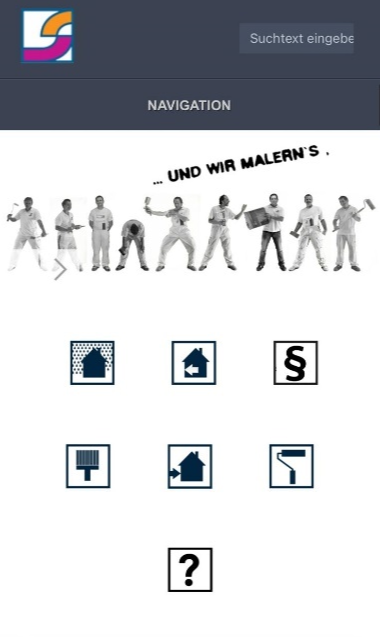
The picture shows the mobile homepage of a painting business. While the paint roller might still give an idea about the content of the following page (it's about color technique), other icons only leave room for guessing. The further disadvantage is that you can “hover” over the icon in the desktop view and thus see the text, but there is no such option for mobile devices.Conclusion: Why is a good website navigation important?A clear and structured website navigation is the basis for a user-friendly website
. You give your visitors
orientation and ensure that they can find their way around on your website. Poor website navigation can lead to users being frustrated and leaving the website without having found what they wanted. In addition, optimized website navigation helps to make your site more accessible to search engines and thus to achieve a better ranking within the SERPs. Our tip: Take enough time for your website navigation! Test changes, regularly query whether your users understand the navigation structure and review whether all relevant keywords are covered. zu erzielen.
Unser Tipp: Nehmt Euch ausreichend Zeit für Eure Webseiten-Navigation! Testet Veränderungen, hinterfragt regelmäßig, ob Eure Nutzer*innen die Navigationsstruktur verstehen und überprüft, ob alle relevanten Keywords abgedeckt sind.
Empfehlenswerte SEO Tools
Weitere empfehlenswerte SEO-Tools kannst du auf OMR Reviews finden und vergleichen. Insgesamt haben wir dort über 3400 SEO-Tools (Stand: Juni 2026) gelistet, die dir dabei helfen können, deinen organischen Traffic langfristig zu steigern. Also schau vorbei und vergleiche die Softwares mithilfe der verifizierten Nutzerbewertungen:


